I'm not really a fan of logos. Seems kind of cruddy to me: a piece of artwork that the artist doesn't get to sign or take credit for, whose sole purpose is to generate media impressions and promote brand recognition. Art for the sake of commerce. Yeah, actually that sounds evil.
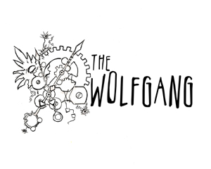
So I made a new logo! But I don't think I want to call it a logo, because of all the logo trash talk in paragraph one, and because the artwork I've done is very meaningful to me. To us, and our dialectic here at the museum. So I'm going to call it the Wolfgang Doodle; not to be confused with Wolfgang Brand Cheese Doodles, coming soon wherever garbage treats are sold. So, should I show the picture and then talk about it? Or talk about it and... Okay, picture.

A burst of flora grinds the gears of a watch mechanism to a halt. Give it time, and we'll do the same.
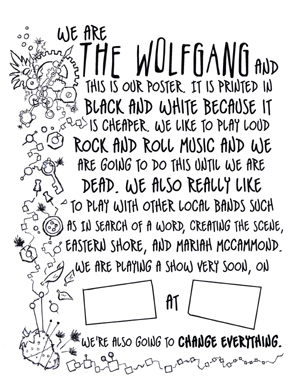
A lot of touring acts and bigger local numbers have these posters with a large photograph and blank spaces for the venue, date, and time of their next performance at the bottom. This essential information is then sharpied into the empty spaces in the "Club Promoter Bold" font. We've talked about doing a print run of these for years, but they're a bit expensive, and we're a bit cheap.
Then I remembered that Doug TenNapel (comic artist, game designer, superhero) draws circles around his competitors, typically with one-color print runs. And I thought about the Bread and Puppet Cheap Art Manifesto that my advisor sent me this semester. And the inspirational DIY art of a few contemporaries of mine in their various endeavors. Yeah. Let's go lo-fi.

I showed this off to a few friends and family this weekend, and three people independently exclaimed "That poor strawberry!" Please. We've all done worse things to strawberries.
xoxo (CW) Alex
Posted Monday, May 6th 2013 @ 11:12
